Origen is a real estate consultancy in Mexico City dedicated to providing strategic advice and project management services using PMI methodology. Origen supports their clients from the development phase of their business model to the supervision and implementation of their project. Origen takes care of every aspect of each project in detail.
For Origen, it was crucial to maintain the essence of things by respecting their history. This idea is tied to the concept of time, and thus, the name "Origen" was born. Origen links the essence of the past and at the same time gives way to the birth of something new.
The two diamonds in the brand identity represent an origin and a destiny. We used this graphic element as a punctuation mark to symbolize a process of transformation. In digital files for Origen, one will always find the name of the brand on the left side of these diamonds, and the title of the project to the right showing that the brand stands for the origin of new projects. This concept can extend to visual elements such as the "before and after" photos of a real estate project.
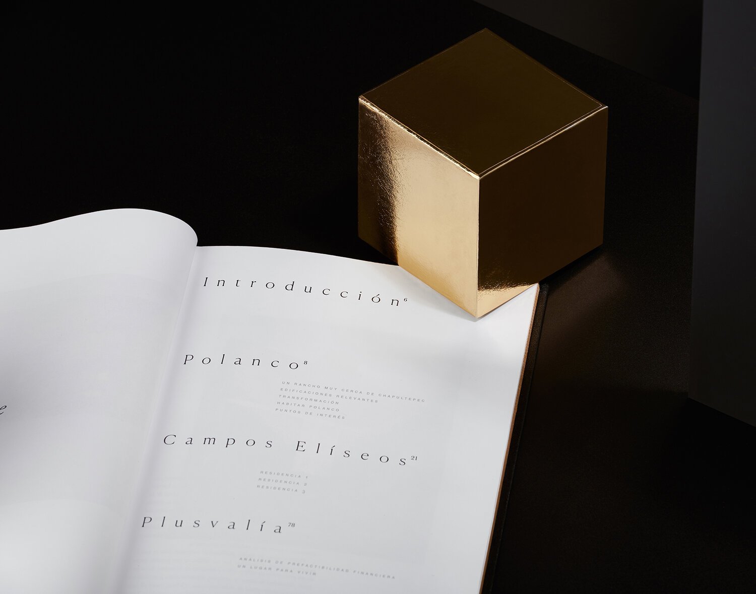
We selected a simple and traditional black and white color palette with gold finishes that provide a classic and sober character to the brand. Considering that we worked with a limited color palette, we paid close attention to the selection of materials on which the stationery is printed. It is precisely these materials that bring a sensory experience to the brand by using white paper with subtle textures and black paper with a semi-velvet texture.
The main challenge of this project was to depict what Origen does and the legal concepts they use to effectively communicate their services so that potential clients would understand what Origen offers and what their competitive advantage is over other consulting firms.


